Category

Tutorials

Buchanan Alive Album Cover 3D Design

Making-of Video Buchanan’s “Alive” album cover

By My Portfolio, TutorialsNo Comments

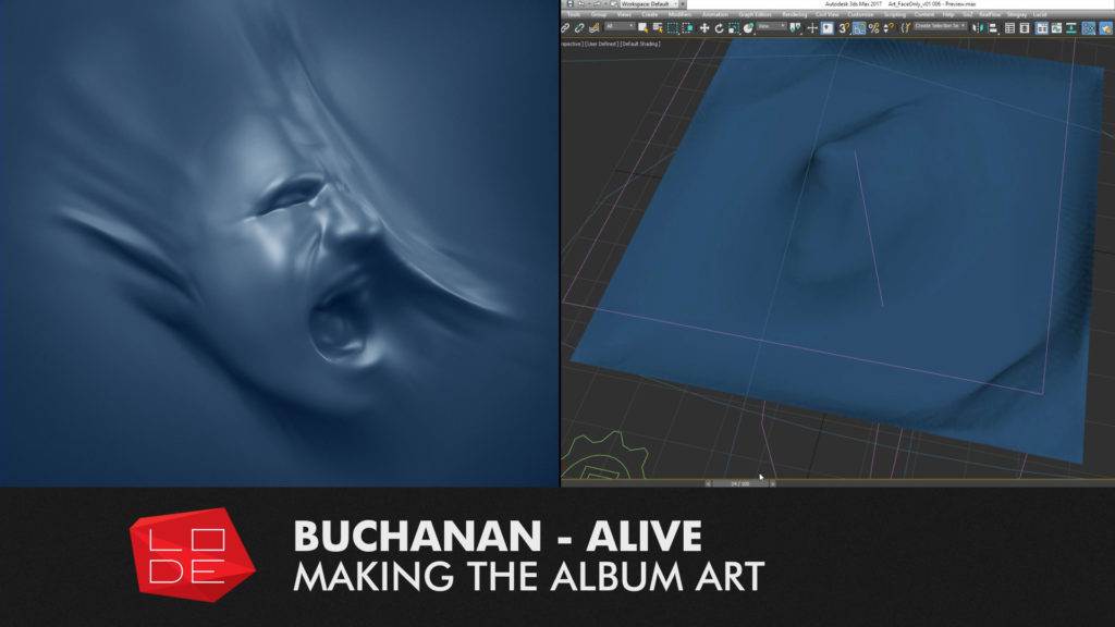
I’ve put together a short “making-of” video for Buchanan’s “Alive” album cover. Alive was released in the last week of October 2016 and I created the album cover which features lead singer Josh Simon’s head twisting under the pressure of a vacuum sheet! Josh wanted it to be cast blue – looking almost like an invert of the Pressure in an Empty Space album.

The video details the different steps that went into the process of creating the artwork.

Alive is available now on iTunes, Apple music and Spotify. You can learn more about the album here on the band’s official facebook page. This live album is linked to the recent “Pressure in an Empty Space” Studio album released by the band. I have more information on “PIAES” here on my LODE portfolio.


Alive Album Art – Process breakdown.

Here is an overview of my process when creating the album cover. More information is available in the video linked above.


Pre-Production

I went through a big phase of planning, brainstorming and pre-production with Josh Simons before we settled on the visual approach to “Pressure in an Empty Space” and how it would carry over to “Alive”.

Photogrammetry shoot

[image title=”Buchanan Alive Album Cover – Photogrammetry Shoot” width=”544″ height=”306″ align=”center” lightbox=”true” group=”BUCH” icon=”zoom”] http://thelode.com.au/wp-content/uploads/2016/11/02_Photogrammetry.jpg [/image]

Production began with a Photogrammetry session with Josh. This is where multiple photos are taken of a subject and the computer is able to reconstruct a digital model of the scene.

Face reconstruction

[image title=”Buchanan Alive Album Cover – Mesh Reconstruction” width=”544″ height=”306″ align=”center” lightbox=”true” group=”BUCH” icon=”zoom”] http://thelode.com.au/wp-content/uploads/2016/11/03_FaceReconstruction.jpg [/image]

This was my first photogrammetry attempt, and so the results were not perfect. I learnt what not to do next time! The resulting model was quite distorted due to many factors including:

[list style=”list_1″] [li]Not enough photographs of the subject [/li] [li]Some photographs were blurry or out of focus
[/li] [li]Only 1 camera was used, so it was inevitable that the subject would move over the course of the shoot. I should have got Josh to lean the back of his head up against the plaster wall to keep it steady and remove clutter from the background[/li] [/list]

Sculpting

[image title=”Buchanan Alive Album Cover – Sculpting in Zbrush” width=”544″ height=”306″ align=”center” lightbox=”true” group=”BUCH” icon=”zoom”] http://thelode.com.au/wp-content/uploads/2016/11/04_Sculpting.jpg [/image]

The digital version of Josh’s face was missing a lot of detail, but it was still great reference for the overall form and proportions, and so I built upon an auto-retopologised version of this model and used my original photos as reference while I sculpted a digital bust myself.

Scene setup

[image title=”Buchanan Alive Album Cover – Preparing mesh for simulation” width=”544″ height=”306″ align=”center” lightbox=”true” group=”BUCH” icon=”zoom”] http://thelode.com.au/wp-content/uploads/2016/11/05_SceneSetup.jpg [/image]

Once the face was ready I did some render tests and then prepared a capped version of the head optimised for dynamic simulation. I only needed the head – not the shoulders, etc. I wanted the topology of the model to be clean so as not to cause issues during dynamic simulations. I wanted to make the head look like it was being compressed under the pressure of a vacuum seal! I used the Lucid plugin for 3ds Max to achieve this. Lucid is a very versatile simulation system created by Ephere.

Simulation of cloth on Face

[image title=”Buchanan Alive Album Cover – Lucid Plugin for 3DS Max” width=”544″ height=”306″ align=”center” lightbox=”true” group=”BUCH” icon=”zoom”] http://thelode.com.au/wp-content/uploads/2016/11/06_Simulation.jpg [/image]

I then did some tests in how to set up my scene for Simulating. I sat the digital face on a flat surface & created a digital sheet that would be draped on top. I placed a large “Spherical Gravity” spacewarp below the face. It acted like a black hole – a vacuum that would suck all air in the area into its centre.

This, plus some gravity, wind and turbulence caused the sheet to try and push “through” the face as best it could – however the face would not let it. I found this was a quick way to get predictable results, and the Lucid plugin performed superbly.

Detail Sculpting

[image title=”Buchanan Alive Album Cover – Sculpting HiRes Mesh in Zbrush” width=”544″ height=”306″ align=”center” lightbox=”true” group=”BUCH” icon=”zoom”] http://thelode.com.au/wp-content/uploads/2016/11/07_Sculpting.jpg [/image]

After getting a satisfactory result (it took about 5 different simulation attempts to find the right settings), I exported one “Frame” of the cloth simulation to Zbrush. I also sent the underlying head/ground geometry to use in projection painting if needed. I then spent my time sculpting in extra details specifically where I wanted them, stretching and warping the cloth further, and getting the final desired look.

Exporting final high-res mesh

[image title=”Buchanan Alive Album Cover – Scene setup in 3ds Max and Vray” width=”544″ height=”306″ align=”center” lightbox=”true” group=”BUCH” icon=”zoom”] http://thelode.com.au/wp-content/uploads/2016/11/08_ExportingHiRes.jpg [/image]

The original Cloth had been planar UV-Mapped from the top, so it had correct UV co-ordinates – stretching where they naturally should. In the end I didn’t rely on UV co-ordinates in my shaders and the setup was very simple. I exported the Hi-Res mesh from Zbrush to 3ds Max using Decimation Master and Mesh Lab.

I setup my scene for rendering, first the “blue” Shader, then tweaked cameras and lights until I settled on a look that worked. I then spent time with Josh Simons to tweak all settings before the final render.

Final output

[image title=”Buchanan Alive Album Cover – Final Output” width=”544″ height=”306″ align=”center” lightbox=”true” group=”BUCH” icon=”zoom”] http://thelode.com.au/wp-content/uploads/2016/11/09-final-output.jpg [/image]

The scene was rendered in Vray 3.4 in 1 pass, with all required elements – DiffuseFilter, Reflection, Specular, GI, etc. All elements were then re-assembled in Photoshop to do the final Composite and grade. The Zdepth Mask was used to affect only the areas of the face that “Stick Out” of the main cloth. A final colour grade was applied and the image was flipped horizontally before being exported for print and digital use. The artwork was rendered at a resolution of around 5, 400 x 5,400 pixels to retain resolution when printing or scaling.

Conclusion

Every project I’ve worked on with Buchanan has been varied, challenging and extremely exciting, making use of many techniques and technologies, this cover was no exception. In the future I’ll create a video similar to this for the Pressure in an Empty Space cover. I hope this breakdown video and accompanying text post has been interesting and helpful.


Realflow Dspline Daemon tutorial and project overview

Tutorial – Realflow D-Spline Daemon & Project Overview

By Digital Lode Tutorials, TutorialsNo Comments

Here’s a recent tutorial I put together focusing on a project i’ve worked on with Alf Kuhlmann at Reel Pictures over the past 5 months. The video is made up of a project overview of ‘The Wonder of Gold’ animation and a RealFlow tutorial. We supplied 3D animation for this video installation that is now showing on a 12metre x 1.8metre wrap-around screen at the Perth Mint in Western Australia.

The second part of the video is a comprehensive tutorial focusing on the ‘D-Spline’ Daemon in RealFlow. We used the Dspline to create the ‘magical’ flowing water in one of the sequences in the Wonder of Gold.

Realflow – Dspline tutorial & Project Overview

If you found this useful, please check out the Reel Pictures website or our facebook page where we will strive to keep posting more videos soon.
Cheers! – Michael Wentworth-Bell.


Button Text


Video Tutorial - Photoshop Smart Objects

Tutorial – Battle of the Bands Poster Design

By Digital Lode Tutorials, TutorialsNo Comments

This is a short video tutorial covering a recent poster design for a battle of the bands event. The tutorial gives a rundown of my workflow for this project, which was completed in Photoshop and Illustrator.

The main features I cover are Photoshop’s Smart Objects feature and ‘Vector Smart Objects‘ – linking illustrator vector shapes with Photoshop. These features are used to create the warped ’60’s style’ Psychedelic text.

I do a few ‘Battle of the Bands’ style posters like this every year. This time around, the client wanted a ‘sixties’ hippie/psychedelic style theme. If you’re interested in learning more about this project, you can view my dedicated entry in the Lode Portfolio section. There, you can see the main design applied to different formats for digital and print.


Main video tutorial – Battle of the Bands Poster Design:

I relied on a few great textures for this project, most of which were downloaded from LostAndTaken.com

For those unable to watch the video, a written overview of my process is detailed below:

Step 01: Reference Images

Before jumping into Photoshop,The most important thing with every poster is your theme and reference imagery. A solid theme and images for reference will guide you throughout the whole process. A amassed a collection of great images to use as reference for this job. I also found some great tutorials on this style of poster.

Step 02: Design a clear layout

The second important step for any poster is to design clear layout. I collected the body copy I was supplied with from the client and pasted into a word .doc document for reference. I had to ensure that all this information was going to cleanly fit in the design. I did a couple of rough sketches on paper to get the idea locked in. I didn’t bother scanning them in for this job.

Instead I started by drawing a VERY rough draft of all the wavy flowing lines that would separate all my text. I also kept a rough circle where the main peace symbol would go. I imagined where the main band names, support acts and secondary information would fit, and how multiple pieces of text could fit on one flowing line.

When all this was locked in, I used this layout guide layer throughout the rest of the process.

Step 03: Smart Objects

Now was the fun part. I used Photoshop to create and warp all my text. This was something I thought of doing in Illustrator first, but eventually developed a method to do this far quicker in Photoshop. It was important to be able to change the text any time, because clients are always changing text for a poster like this!

I used Photoshop’s smart objects. If you haven’t used Smart Objects before, be sure to watch my tutorial video to how this feature helped me and then I recommend you look for some tutorials if you want to know more.

Smart objects give you the ability to have a ‘non destructive‘ workflow in Photoshop  You can transform, scale and change the contents of an object without losing resolution, add and tweak filters, and go back to your original object at any point. This saves you so much time! In the video you can see how I can easily edit any of my text without having to change any of my warps, etc.

Here is a summary of my basic Smart Objects workflow for this job:

  1. I first typed out my basic text. I set the basic font, but created the text to be about 5x larger than I needed. I could scale it down after it was a smart object.
  2. I then right clicked on each layer, and converted the layer to a smart object.
  3. With these Photoshop text layers converted to Smart Objects, I could now use my warp tool to conform these shapes to my flowing lines. It takes a bit of tweaking, but i was finally able to get each object into shape.

But because these objects are smart objects, i can double-click the layer icon at any time and it will load up a new Photoshop document with my original text! Here i can change the font, change the actual text, change the colour, etc.

If while making any changes, I end up making the text bigger than the actual Photoshop document, I just re-crop it to fit. If I go to the ‘image’ menu and choose ‘trim’Photoshop will crop the document down for me!

I save this document, close it, and you can see all of my changes have been applied to my main poster!

What’s more, I can go back to my warp tool, and it remembers all my settings for the warp. I can tweak to my hearts content. If this layer wasn’t a smart object, and i returned to the warp tool, it would have reset to a square shape again. This saved me so much time!

I created all of my swirly psychedelic text and then had the design of all text approved. As expected, the text for this document changed multiple times, but because of smart objects, these updates were fairly quick and easy for me.

 Step 04: Using Vector Smart Objects with the help of Illustrator

With text approved, I then used illustrator for my final text. Watch my video and see what happens when I zoom into my document at 100% – you can see my text has pixelation and aliasing  This is to do in part with the smart objects and the warp tool. As you can see, these smart objects feature is not always perfect. But illustrator can fix that. I collapsed my layer stack by duplicating the group and hitting ctrl+shift+e (on windows).

I then saved this image out as a png, and imported that into illustrator. I added a black border around the edges so it would match up perfectly later on (watch the video to see how this helped). The live trace feature then gave me the shapes I needed.

I then selected everything and dragged it back into Photoshop again. You can see in my LODE video tutorial that the objects have been bought back into Photoshop as a vector smart object now! I can scale them and they wont loose quality. Because I had a black line around everything before sending it to Illustrator, it all lined up perfectly.

And because these shapes are smart objects, i can easily change my text colours + vectors inside of illustrator on the fly.

Step 05: Final Touches

The final touches were all kept in the Photoshop groups at the top of the layer stack. This included a few adjustment layers, layer masks and a crumpled paper texture. At the end of my video tutorial you can see the affect each layer gave to the overall poster.

I then had my main poster design, which i added crop marks, flattened the document and saved as pdf, ready to print!


That is a quick overview of my process for this poster. I hope you were able to check out the actual video and I hope you’ve learnt something new. If you have any questions, leave them as a comment on this page or on the video’s  YouTube page. Or if you have suggestions of how I could have streamlined this project further, share your ideas as well!

If you found this useful, please check out the rest of my website or facebook page, where I will strive to keep posting more videos soon.
Cheers! – Michael Wentworth-Bell.


Button Text


Vray Tutorial – Vray Embree Helper

By Digital Lode Tutorials, Tutorials

Quick Video about the Vray Embree Plugin. This is the first in (what I hope to becomes) a regular series of Tips & Tricks videos focused on Vray.

I’ve recently come across the Vray Embree Helper object; a plugin that is currently separate from the standard Vray installation. The VrayEmbree plugin allows for render speedups between 20-30+ % when rendering with Vray on an intel processor.

This quick video gives an overview of the plugin with a render comparison and covers the installation and how to use the vrayembree helper in your 3ds max scene.

Download the Vray Embree plugin from the Vray tools page:
http://www.spot3d.com/vray/misc/

Release thread on the ChaosGroup forums:
http://www.chaosgroup.com/forums/vbulletin/showthread.php?68970-Embree-raycaster-for-V-Ray&highlight=Embree

Intel’s official page for the Embree Kernels:
http://software.intel.com/en-us/articles/embree-photo-realistic-ray-tracing-kernels/

Official Intel Embree forum:
http://software.intel.com/en-us/forums/embree-photo-realistic-ray-tracing-kernels

i7 Processor Comparison:
http://en.wikipedia.org/wiki/List_of_Intel_Core_i7_microprocessors#Desktop_processors


Button Text


Tutorial 02 – Storyboarding a Short Film

By Digital Lode Tutorials, TutorialsOne Comment
[image title=”An overview of my Storyboarding Process” width=”544″ height=”385″] http://thelode.com.au/wp-content/uploads/2012/06/Photoshop_Brush.jpg [/image]

I spent the 2nd half of 2011 working on the ‘Last Guitar Hero’ – an ambitious short film that was shot in ‘1st person perspective’ and in Stereoscopic 3D. This short tutorial covers the storyboarding stage for the film and details my workflow during these pre-production stages.


Button Text Tutorial is hosted on my second website ‘LastGuitarHero.com’


In a nutshell, my method of storyboarding involves using Photoshop and After Effects together so I can create a storyboard & animatic at the same time. For an animated production, or a Video production that relies on CGI & Visual FX, I think a method like this is timesaving and helpful! You can follow the link above to view the tutorial on my second website, ‘LastGuitarHero.com,’ which has been setup specifially for my short film. The short film was part of my final honours year assessment and is sadly yet to be completed. It will be, one day!


Button Text


Tutorial 01 – Motion Blur In After Effects – All you need to know

By Digital Lode Tutorials, TutorialsNo Comments


Originally created for my student blog, this tutorial gives viewers an overview of motion blur and how this effect is achieved within After Effects.

The video covers both the standard motion blur switches, the global settings for motion blur, as well as some 1st and 3rd party plugins that can help you add motion blur to sharp footage or 3D rendered animations.


Button Text